Making a More Accessible Web
Web content accessibility has been on my mind recently as I watched one of the other engineering teams at Intercom in San Francisco undertake to make the Intercom Messenger accessible and compliant with the Web Content Accessiblity Guidelines (WCAG) 2.0 Level AA. Despite the continued growth and evolution of the internet it has yet to really live up to its true potential as universally accessible communication, and the accessibility landscape of online content is no exception. In the process of recreating my blog I decided that I wanted to learn about the various standard components that make up web accessibility and see what I could do about implementing them here. Here’s a bunch of changes that I made to the blog as a result of my search.
Background on tooling
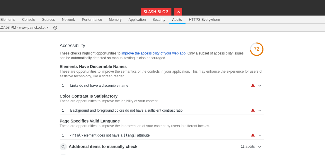
The first resource that I turned to was the accessibility auditing that’s currently built into the Chrome developer tools. They’re contained in the Audit or “Lighthouse” tab alongside a battery of other automated tests that ship with Chrome.
Chrome Developer Tools
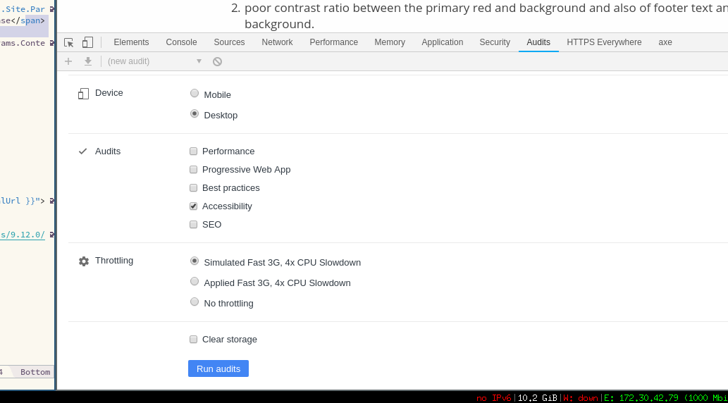
This check takes only a few seconds to run and immediately produces a list of actionable items with obvious accessibility wins. It also provides helpful examples and links to the page source in relation to specific issues.
The two major items that Chrome identified on my own site were:
- a number of links without associated alternative text descriptions
- poor contrast ratio between the primary red and background and also of footer text and background.
- no language attribute specified on the page’s opening
<html>tag
Fixing the broken links was a simple case of renaming the existing attributes to confirm to the newer standards, in this case swapping title for aria-label on each of the icon links in the site header.
{{ with .Site.Params.email }}
- <a class="button-square button-social hint--top" data-hint="Email" title="Email" href="mailto:{{ . }}">
-   <i class="fa fa-envelope"></i>
+ <a class="button-square button-social hint--top" data-hint="Email" aria-label="Email" href="mailto:{{ . }}">
+   <i class="fa fa-envelope" aria-hidden="true" ></i>
  </a>
{{ end }}
Changing the colors for the alternative text such as post descriptions to increase the contrast ratio was also made simple by the color picker which is built into the development tools. This allows you to make a quick visual selection and copy the appropriate hex value to your clipboard for easy editing.
With that and some other minor tweaks Chrome was suddenly much happier with the results giving us a clean bill of health.
Axe Chrome Extension by Deque
The second resource that I used to evaluate the the results was the Axe Chrome Extension by Deque which came recommended by Daniel of the previously mentioned Intercom work. Like the Chrome tools the extension provides a new tab in the developer tools which produces reports based on automated offline tests. This is especially helpful when you’re evaluating your work in a development environment.
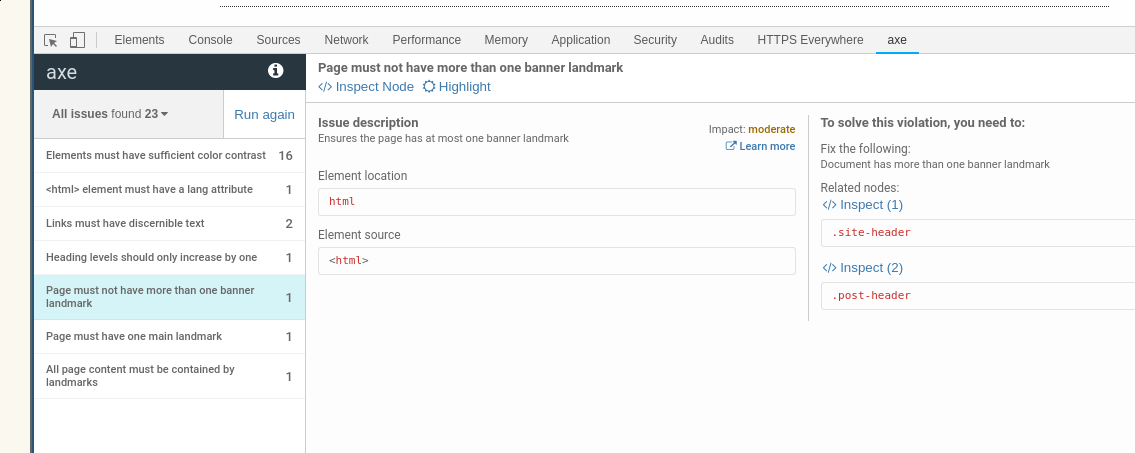
The most notable of the issues that Axe discovered was that the page’s landmark elements (elements such as header, navigation, main, and footer which allow screen readers to structure results) were in disarray as I was both missing some but also had duplicate of others. Fixing this was very straightforward and required only one or two lines worth of changes. It also pointed out that some of the social sharing links at the bottom of each post were broken and so I decided simply to remove them instead of rehabilitating them.
End result
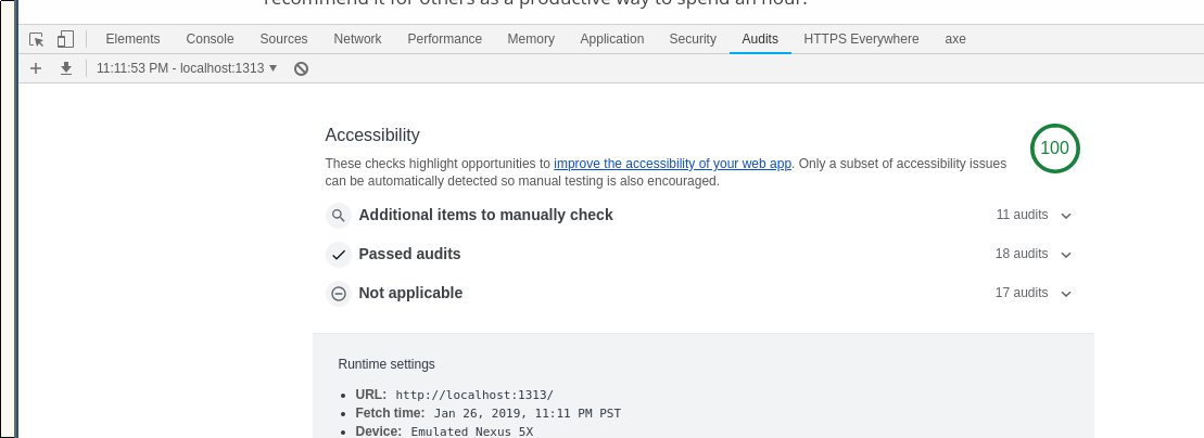
Overall once I found the tooling to give me my initial direction this ended up being a very simple process to follow to improve the accessibility essentials. I’m going to look for development tooling that I might be able to use as part of the site build process to notify me of any issues before I deploy, but for now the axe extension and the native Chrome tooling should suffice. I found this a fun experiment to catch up with some new web developments that I wasn’t previously very familiar with, and I’d recommend it for others as a productive way to spend an hour.